Press Kit
The Sleipner logo is the foundation of our brand's visual identity. We use a strong and steady typeface with a logomark hinting at movement, boating, and Nordic history with the eye of Odin.
Primary Logo
The primary Sleipner logo comes in two-tone colors and black and white versions for use on layouts with several tones (i.e. pictures) for better visibility of the logo.
Clear Space
This pertains to the clear space between the logo and any other element, in any direction. The height of the Sleipner name is the minimum clear space the logos should have, as shown above.
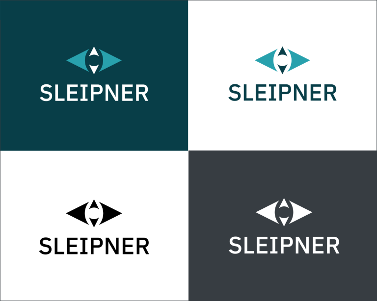
Logo variations
The logo comes in a few varieties in order to give flexibility.
Logo Usage
- Use the primary logo on solid backgrounds, preferably Sleipner's own Petroleum, light Charcoal colors, or White.
- Use the primary logo on smaller version when lack of space.
- If the background is too busy even for the black or white logo versions, place a solid color block under the logo.
- Use the tagline logo (Ocean born. Tech bred) for brand building exposures.
- Our logos should never be redrawn, distorted or changed in any way.
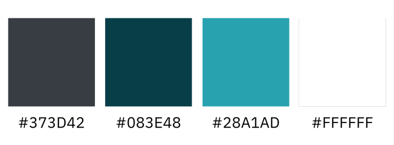
Colors